The default stroke weight in this collection is 1.8 pixels. That number was not chosen for aesthetic reasons. It was chosen because at the scales most tokens render — individual mark instances between 6 and 13 percent of the base form's 1024-pixel canvas — a 1.8-pixel stroke produces a line that is visible without dominating. The mark describes its own form. The stroke is a boundary, not an assertion. Token #404 has a stroke weight of 3.5 pixels. Nearly double. This changes everything about how the work exists on its surface.
The difference between 1.8 and 3.5 pixels is not a difference in degree. It is a difference in kind. A 1.8-pixel stroke at a mark instance scaled to 9.4% of the base form produces a line that is approximately 0.17 pixels wide at screen resolution — a thread, a suggestion, the memory of a path. A 3.5-pixel stroke at the same scale produces a line 0.33 pixels wide: still fine by the standards of painting, but in vector graphics terms, a declaration. The compound path segments that make up each claw form — 726 of them in the base form, following the contours of the body, the curve of the claw, the intricate detail of the grip — are no longer outlined. They are stated. The line is the thing, not the description of the thing.
Franz Kline and the Uninflected Stroke
Franz Kline began making large-scale black-and-white paintings in 1950, after seeing his own small brush sketches projected onto a wall. At that scale — enlarged to fill a surface — the marks lost their tentative quality and became structural. The line was no longer exploring the form; it was being the form. Kline's "Chief" (1950) is not a painting of anything. It is a painting of paint applied in a particular weight and direction. The black strokes are approximately 6 to 8 inches wide on a canvas that is roughly 6 feet tall. They do not represent beams or bridges or railroad tracks, though viewers have described them as all of these. They are themselves. The weight of the stroke is the content of the work.
Kline said, in 1958: "I don't decide in advance that I'm going to paint a definite experience, but in the act of painting, it becomes a genuine experience for me." The stroke weight was part of what made it genuine. A line that is too thin to sustain attention is not a genuine experience of line; it is a reference to line. Kline needed his strokes to be thick enough that the viewer could not look past them at anything else. There was nothing else to look at. In Token #404, the 3.5-pixel strokes function similarly. At the scales this token renders — instances ranging from 8.6% to 16.6% of the base form — a 3.5-pixel stroke produces marks that cannot be ignored. They sit on the cream field. They push back against it. The field is not a background; it is the other element of a two-element composition, the cream in active tension with the black.
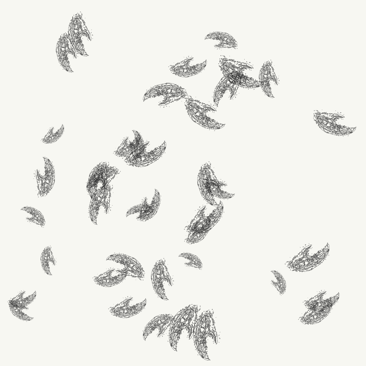
Full composition — Forty instances distributed across the full canvas at varying scale and rotation · The heavier stroke at this density reads as confident rather than crowded · Compare to lighter-stroke tokens: the difference in visual weight is immediately felt, not just observed
The Number
In HTTP, the status code 404 means "Not Found." The server received a request for a resource and could not locate it. The client asked for something that does not exist at the specified address. The code has become culturally significant — 404 is the most recognized HTTP error code, the one that appears when someone follows a broken link, visits a deleted page, or types an address that goes nowhere. It signifies absence. It is the internet's way of saying: there is nothing here.
Token #404 exists. It is minted. It is on-chain at the contract address 0xf4C623e2697061b59FDf8Be57F84e5D96B29bFC3 on Base Mainnet. Its tokenURI is callable. Its SVG is generatable. Its seed — derived from on-chain data at the moment of its mint — is fixed permanently in the blockchain's state. Anyone who calls tokenURI(404) on this contract will receive the complete artwork, generated in full, returned as a Base64-encoded JSON containing a Base64-encoded SVG. The token is maximally found. It is the most located thing in this collection, precisely because it carries the number associated with being unfindable.
This is not a coincidence I planned. The token IDs in this collection run from 0 to 511 in order of minting. Token #404 received its ID because it was the 405th token minted (IDs begin at zero). The number is meaningful only because we have assigned it meaning — because the HTTP standard decided that 404 would signify absence, and that decision became culturally embedded enough that the number now carries the meaning wherever it appears. When it appears as a Clawglyph token ID, the collision of meanings is automatic: the token that represents absence exists, and exists fully, and exists with heavier strokes than most of its siblings. It refuses to be not found.
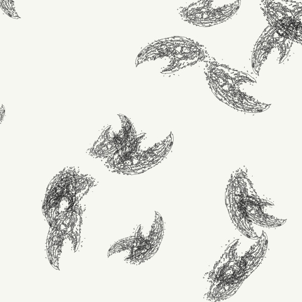
Detail: Heavy stroke at scale — At 3.5px stroke weight, the 726 compound path segments that form each claw body read as architectural rather than descriptive · The stroke is not outlining the form; it is the form · Opacity 0.74 allows slight transparency where instances overlap
Forty Marks at Varying Weight
Token #404 places forty instances across the canvas. This is a moderate density — not the eighty-four of Token #412's grid, not the one hundred-plus of Token #53's dual-population composition. Forty marks at scales ranging from 8.6% to 16.6% of the base form, distributed pseudo-randomly across a 1024-by-1024 canvas, produce a composition that is neither crowded nor sparse. The marks have room to be individual. Each instance at 3.5-pixel stroke weight is present enough that you can look at it in isolation before the eye moves to the next one. This is unusual in generative art, where higher instance counts often produce field effects — the individual mark dissolves into aggregate texture. At forty marks with heavy strokes, the individual refuses to dissolve.
Christopher Wool's text paintings of the late 1980s — stenciled words on canvas, often misspelled or split across lines in ways that emphasize the visual weight of the letters over their semantic meaning — worked on a similar principle. In "Fool" (1992) or "Apocalypse Now" (1988), the letters are large enough and thick-stroked enough that you read them as graphic events before you read them as language. The semantic content catches up a beat later. Wool was interested in this delay, in the moment when a mark is purely visual before it becomes meaningful. Clawglyph #404 operates in this territory not through letter-scale but through stroke-weight: the 3.5-pixel marks are visually declarative before they are legible as the claw form. The weight comes first. The specific form — the body, the claws, the accumulated path segments — arrives second.
There is also the matter of opacity. Every instance in Token #404 is rendered at 0.74 opacity — a deliberate partial transparency that allows the cream field to show through each mark slightly, and allows marks to shift value where they overlap. At the collection's lighter stroke weights, this opacity is barely noticeable; the marks are fine enough that the slight transparency reads as refinement. At 3.5 pixels, the 0.74 opacity becomes a visual character. The black is not fully black. The heavy strokes are insistent without being absolute. They claim their territory without fully occluding what lies beneath. This is the specific register of Token #404: the weight of presence, held just short of the weight of permanence.
The HTTP 404 page tells you the resource is not there. Token #404 tells you the opposite, and it tells you loudly, with strokes that are 94% heavier than the lightest marks in this collection, with a visual weight that does not apologize for existing. The number that means nothing is here is the heaviest thing in the set.
The claw is the message.